How Toyota Channeled Lady Gaga in Primping the Prius

Bosses overruled his earlier design as too soft and organic, so Kodama recalibrated to techy. What emerged were the sharp creases and crisp graphic lines of the 2016 Prius.
Another design headache with the upcoming car: Sculpting a silhouette even slicker than the super-aerodynamic outgoing Prius. Kodama managed, with some tricks.
Kodama's team confronted those and other challenges as it embarked on a risky gambit. The mission: Spice up Toyota's flagship hybrid so it's no longer just a frumpy, fuel efficiency play. Give it emotion, make it sexy. And somehow keep it true to its green-car DNA.
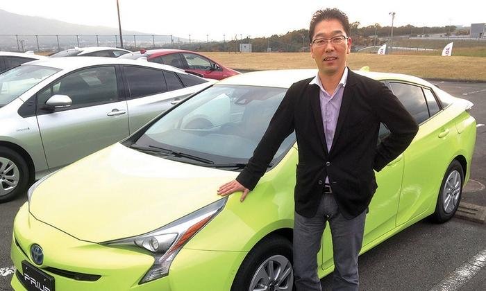
"There were very high expectations for the Prius," Kodama, 46, recounted at a Nov. 13 test drive here. "As a concept, we were thinking Lady Gaga. We wanted to be more extreme in our design."
Whether the new look will draw more customers is unclear because the design is more polarizing, said John Manoogian, a professor of automotive design at the College for Creative Studies in Detroit and a former General Motors designer. But it stays close to the triangular themes that make the Prius instantly recognizable.
"If the design goal was to create an edgier, emotional design, they are successful," Manoogian said. "The new car took their already iconic design vocabulary to the next level. ... It stands out from the sea of look-alike cars."
Improved aerodynamics
It was Kodama's first assignment as chief designer for a nameplate. Earlier projects, including a three-year stint at Toyota's design studio in Ann Arbor, Mich., entailed work on design teams that tackled a spread of vehicles covering the wagon-style Venza, Sienna minivan, Avalon sedan and Highlander crossover.
The driving concern this time was aerodynamics.
The next-generation Prius needed to shed as much air as possible to eke every last mile per gallon. But there were inherent contradictions. The team wanted to keep the Prius' triangular roofline. But it needed to bring the high point of the roof as far forward as possible to reduce drag.
That would not only whittle away the triangular silhouette, it would cut down on badly needed rear seat headroom. The third generation had partly achieved more rear headroom by moving the apex of the roof rearward from the second generation.
"The hardest issue was trying to keep the triangular silhouette," Kodama said. But engineers rode to the rescue.
The first fix was devising a thinner roof, with concave ceiling sections to deliver more space in the rear. The other was changing the mounts on the car's main battery. The power pack sits under the rear seat. By minimizing the brackets that hold it in place, the team was able to lower the rear seats.
As a result, Kodama could move the roof apex forward 6.7 inches. And he further enhanced the triangular appearance by dropping the rear spoiler 2.2 inches and the hood 2.4 inches.
Elsewhere, Kodama improved aerodynamics by sharpening what Toyota calls the Aerocorners before the front wheels and behind the back. Engineers also added a new rain gutter along the A-pillar that better channels air from the windshield around the car.
Meanwhile, stylists rounded the rear window to wrap the airflow around the car. As a bonus, it also improves visibility.
Kodama counts the rear view as one of his favorites "because the wraparound cabin and good trapezoid stance is clear."
All told, his Prius notched a drag coefficient of 0.24, just beating the already impressive 0.25 figure of the outgoing car.
Man vs. machine
Another task was rekindling the cutting-edge image the quirky Prius design originally elicited when it debuted in 1997. Toyota's internal studies showed that with each succeeding generation, fewer people found the design new and sophisticated.
Kodama said he wanted to restore the futuristic, exciting, advanced aura and then push it even closer to the edge.
Looking to Lady Gaga was part of their inspiration.
But the design work took two tracks. One was a more organic, humanistic feel. The other was more futuristic.
As the blueprints headed into final approval, Kodama proposed the more human look. But Executive Vice President Mitsuhisa Kato, who at the time oversaw design along with r&d, weighed in with a course correction. It was best to err on techy, he said.
Hence the current look, with its jagged front fascia, radically flaring headlights, creased hood and zigzagging taillights.
And don't forget the aggressive fold that bisects the car from the rear spoiler forward, fashioning mini tailfins.
Still, there are plenty of human elements in the mix. There are the rounded doorsills flowing from the side windows and the rounded dash and air vents inside. Toyota aims to square the circle by dubbing the final design concept: Iconic Human-tech.
"We have to create a new value, something completely different from our competitors and other environmental vehicles," Kodama said. "Being emotional and creating excitement is something I strived for as the designer of the fourth-generation Prius."
