Android Auto gets a big update, and it's going to be way better

Android Auto users are in for a treat as Google just unveiled a complete overhaul of the interface. We can safely say it looks a whole lot better than the current system, and we're excited to try it out.
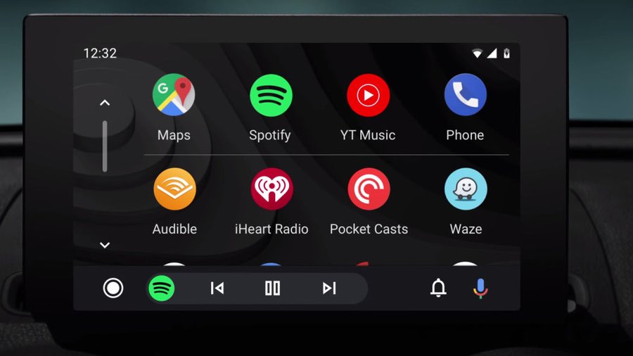
To begin, there's a new launcher. Instead of the five buttons along the bottom, now there's an array of apps to choose from in a vertically scrolling interface. This looks a whole lot more like the app drawer on your actual phone, and should make choosing your desired navigation or audio app much more intuitive. The launcher looks more like Apple CarPlay, but scrolls vertically instead of sliding from page to page horizontally.
Even more is the new "navigation bar" you see on the bottom. This bar stays on your screen and changes its function based on what app you're using at the time. For example, if you're using navigation with Google Maps and listening to a podcast at the same time, you can fast forward or rewind the podcast without having to leave the Google Maps app because the navigation bar has audio playback controls on it. Also, if you have the music app of your choice loaded up while navigation is running, your next move/direction stays plastered on the bottom navigation bar. What this does is reduce the amount of inputs and taps because you don't have to switch apps to reach your desired controls. This is a big step forward if we're thinking about driver distractions, because now you can pay less attention to navigating through the screens and more on the road.
Then there are several less significant but still noteworthy additions. Google is introducing a newly-designed notification center that allows you to see recent calls, listen to messages and view alerts. There's also a new dark theme that was sorely needed. Apple CarPlay has always looked more polished with its dark theme that blends in nicely with most car's interiors. Now Android has them matched, and it looks just as elegant. Finally, Android is adding in wide-screen optimization for some of the abnormally wide displays we're seeing in cars today. This will make sure the OS is using all the possible screen real estate provided. Google says the update will be rolling out to all Android Auto equipped cars this summer.
Related News
